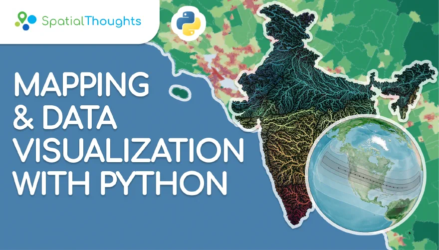
This is an intermediate-level class that covers Python libraries for creating static and dynamic visualizations, dashboards, and interactive web apps. You will learn how to create charts, maps and animations using various Python packages. You will also learn about how to create and publish interactive apps and dashboards by just writing Python code.
Schedule
All times are India Standard Time (IST, GMT+5:30).
Use the local time link on each session to see it in your time zone.
I’ve had the opportunity to attend multiple training programs at Spatial Thoughts, and each one has played a vital role in reinforcing and expanding my skills in open-source GIS technologies. A standout experience was the “Mapping and Data Visualization with Python” course. Before the course, I reviewed the Python Data Science Foundations video series on Spatial Thoughts’ YouTube channel, which was incredibly helpful for recapping key concepts. During the course, we explored:
Static visualization using Matplotlib, Seaborn, GeoPandas, and Contextily, Raster visualization with Xarray and rioxarray, Interactive mapping with Folium and Leafmap, Web app development using Streamlit to build spatial dashboards
We also explored emerging libraries like Lonboard, a powerful tool for visualizing large vector datasets. The live Colab-based walkthrough (link) was a great example of how Spatial Thoughts stays on the cutting edge of spatial visualization.
The training sessions are highly interactive and learner-friendly, featuring a mix of lectures and exercises. All sessions are recorded and made available afterward, which is great for self-paced learning or revision.
What I admire most is that Spatial Thoughts is not just a training provider, but a global learning platform dedicated to modern, open-source geospatial technologies. They consistently bridge the gap between traditional GIS skills and the evolving needs of large-scale spatial analytics and data-driven decision making. I continue to follow their updates and learning materials closely and would highly recommend Spatial Thoughts to any GIS professional, data scientist, or geospatial enthusiast looking to build cutting-edge skills with open-source tools.
In the age of AI and endless online resources, it might sound like a paradox, but what truly makes the difference is the guidance of an instructor like Ujaval and Vigna. That human touch is what turns learning into real growth.
Ever wondered how those cool maps are made? This course has the answers. Ujaval Gandhi teaches you how to visualize spatial data using Python — from vectors to rasters. You’ll explore Matplotlib, Folium, Leafmap, and the best part? Building your own Streamlit web app with just a few lines of code. Mind = blown.

 France
 Spain
Spain
 India
India